REKS
5 UX Interns
1 UX Lead
My Team
My Role
UX/UI Intern
Tools
Figma
Figjam
Photoshop
Duration
1 Month
Project Kickoff
REKS is a brand that makes durable and affordable eyewear products. What makes them unique is their frames are made from advanced polymers, which makes them flexible. With a commitment to quality, REKS offers a variety of lenses, diverse frame materials, anti-reflective coating, and UV protection, all infused with a sense of fashion and an affordable price. Our client required our assistance because they lacked clear communication of their value to customers, especially concerning their exclusive lens materials and technology. The client needs help conveying the value of REKS sunglasses and aiding customers in deciding and purchasing the perfect sunglasses for them.
When my team and I kicked off the project, we focused on understanding the business objectives and goals. Having a clear grasp of these aspects is crucial for effective solutions.
Our process involves specific strategies at each step to solve the business goals:
Design Process
Empathize
Define
Ideation
Prototype
Test
Empathize
Quantitative Research
Desk Research
We used Google Analytics to check user behavior across the website and mobile platforms. Our focus included revenue breakdown between desktops, different mobile devices, and user demographics. We covered the bounce and exit rates; we figured out how to improve the website for everyone.
Based on data from the past six months, users are more likely to browse the website using their mobile devices rather than desktop computers. The bounce rate is also high on desktops compared to mobile on several platforms.
My team and I used Google Analytics to understand user behavior across the website and various platforms. For better insights, we focused on revenue breakdown, bounce, and exit rates.
Design Evaluation
with Intuitive
Design Principles
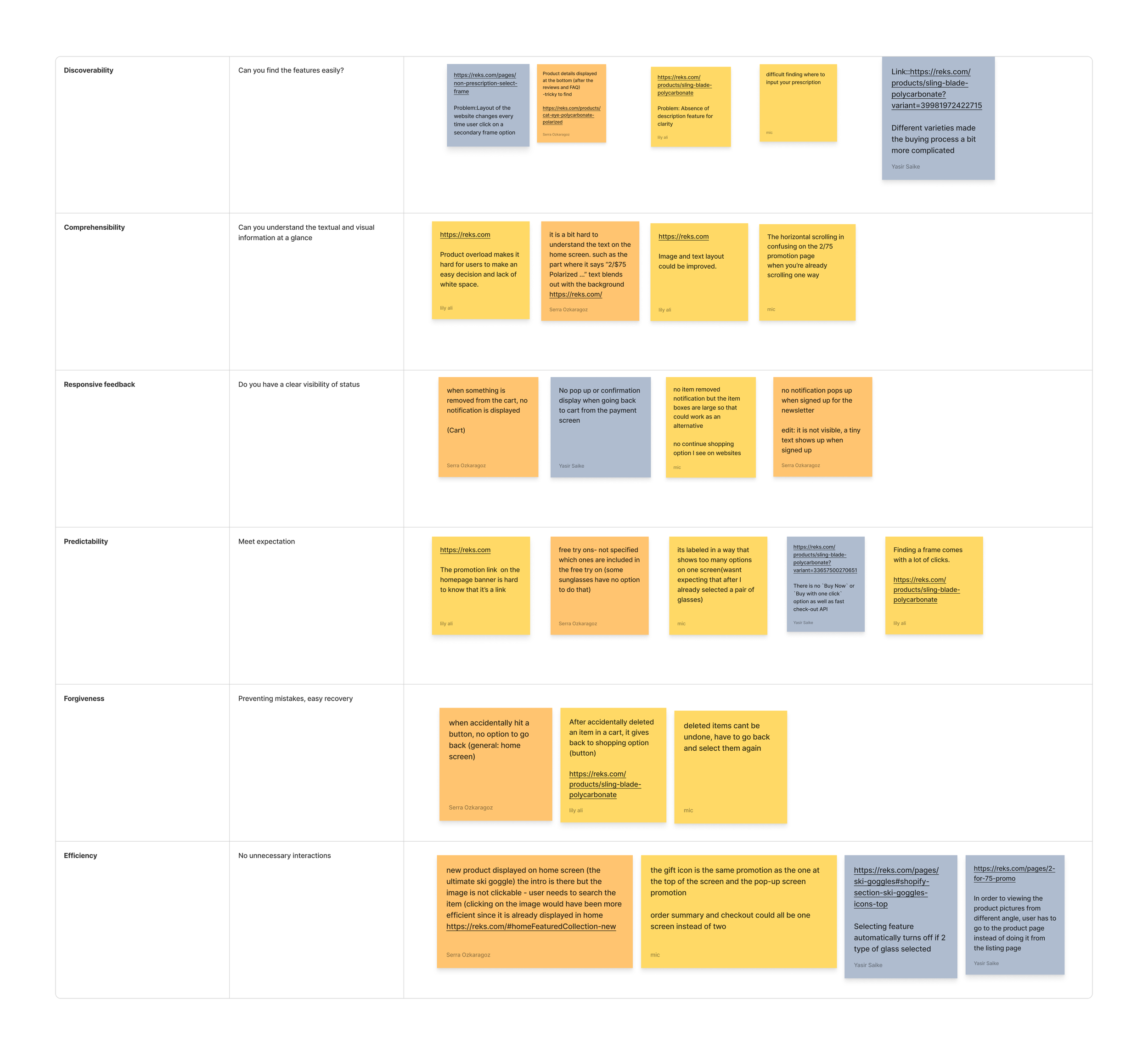
We did a design evaluation using intuitive principles and found several issues. Important features were hard to find, information wasn’t clear, and the status indicators weren’t visible enough, making it hard for users to know what was happening. Additionally, there was a lack of easy error recovery and too many unnecessary steps. Summarizing, our evaluation highlights the need for significant simplification and improvement in our design.
My team and I collaborated on Figjam, each contributing sticky notes describing our observations of each design principle on the mobile site REKS.
Competitive Analysis
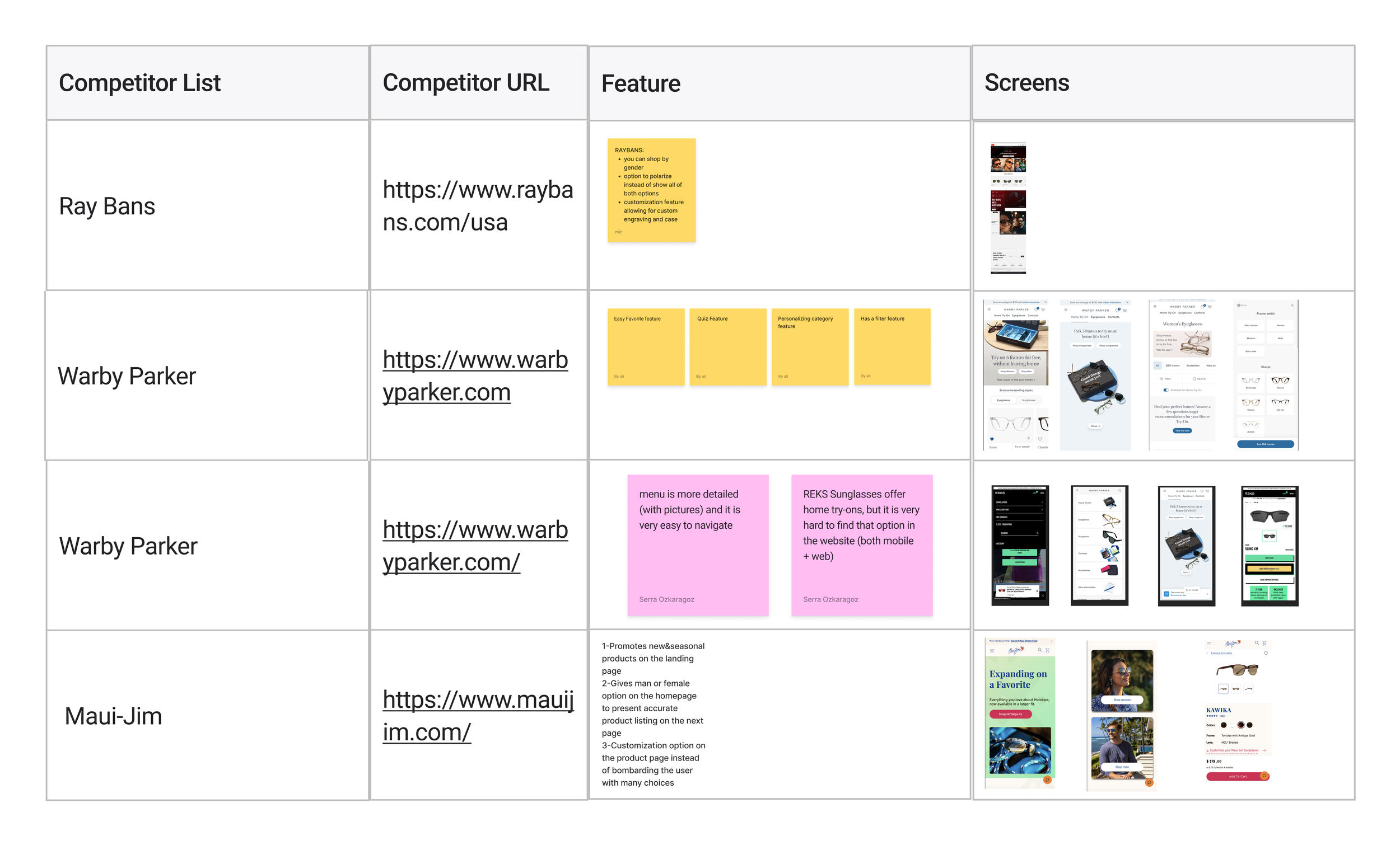
We conducted a compitative analysis to help us understand what your competitors are doing well, what they're lacking, and where there might be opportunities for differentiation. We went over their designs, features, and user experiences.
We worked on FigJam, listing competitors' features and designs.
CompetitorsStrength
and Weaknesses
We listed out all our competitors strength and weakness so we can use that information to find ways to stand out. We focused on things they do well that we don't for inspiration, and finding new ideas that they haven't.
We listed the strengths and weaknesses of our competitors on Figjam.
Qualitative Research
User Interview
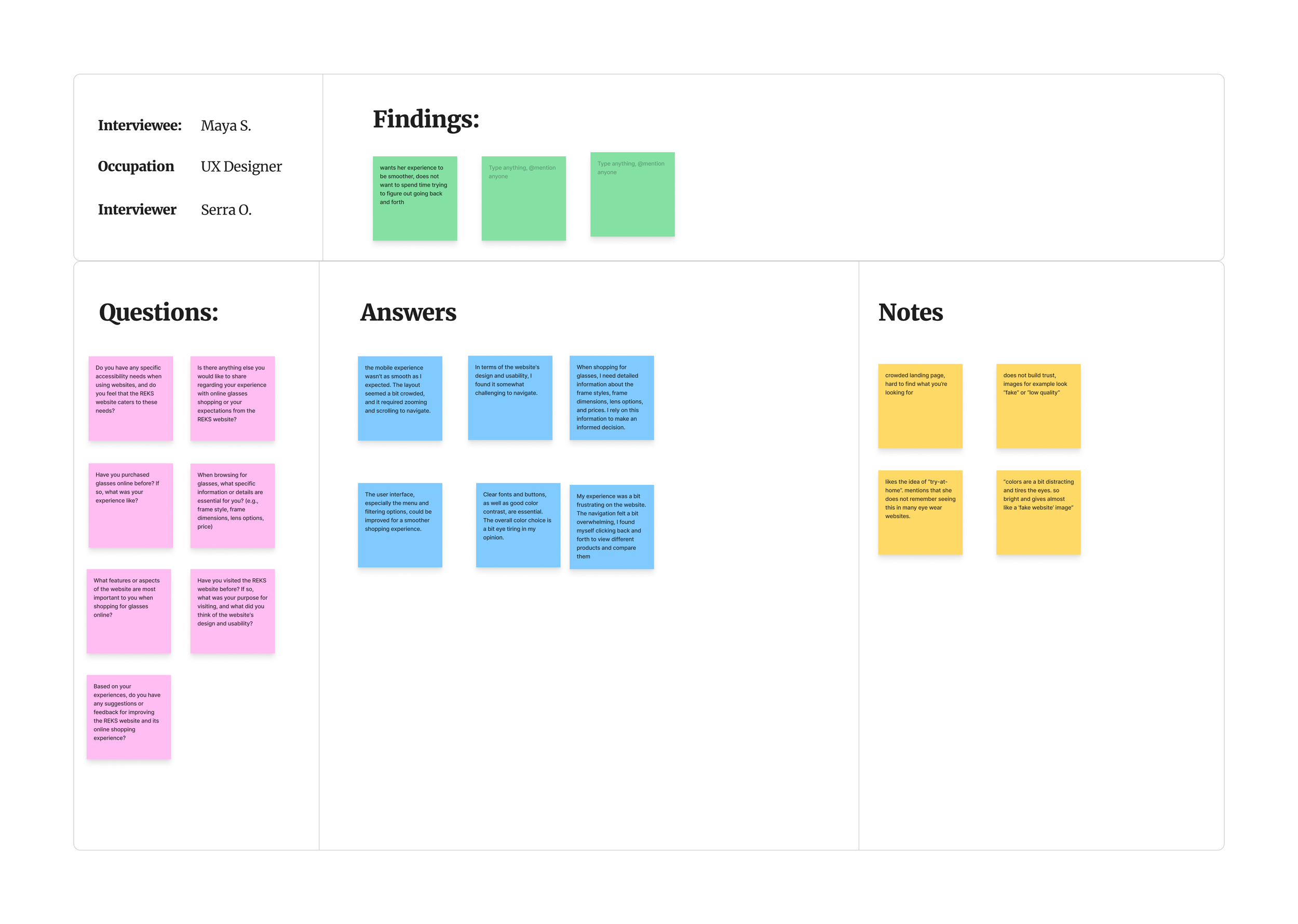
As part of our research, we conducted a user interview to gain user insights and validation. The interviews aimed to gather insights into user experiences, focusing on improving usability, simplifying content presentation, enhancing image interaction, and clear product descriptions.
My team and I created interview questions using FigJam.
Summary
User Interview
We checked how users use the site with Google Analytics. It turns out that more people use phones than computers. But there's a problem—more people leave the site quickly on computers. The design review showed that essential things are hard to find, and some information is confusing. By looking at other websites, we got ideas for improving the site. We found out that users want more straightforward layouts and more precise information. With all this info, we're ready to make the site easier to use!
Define
How might we
After gaining insight from users' pain points, we began identifying the problems we discovered and turning them into opportunities to enhance the user experience. We achieved this by creating “How Might We” questions.
My team and I worked together on FigJam, adding "How might we" questions to sticky notes.
Prioritization
Next, we categorized our “How Might We” questions and voted on which would make the most significant impact.
We used FigJam to organize our ideas into groups, and my team and I voted on the best "How might we" questions.
Top HMW’’s
1. Enhance user trust by using high-quality images that resonate with the users.
2. Add visual engagement to showcase the product.
3. Improve the main page to avoid user confusion.
4. Simplify product descriptions for better user understanding.
ICE
We then narrowed down our most voted choices using the ICE Scoring method. The resulting prioritized "How might we" questions are those with the highest combined scores for impact, confidence, and ease of implementation. These questions represent our top choices for addressing problems effectively.
Next, we used a bullseye chart to prioritize the "How might we" questions based on high, medium, and low levels.
My team and I used Ice score and bullseye techniques to organize our ideas efficiently in FigJam.
Ideation
Crazy 8s
We applied the Crazy 8s technique to brainstorm eight ideas for the promotion, home, prescription, and product pages. We sketched out quick concepts within a limited timeframe to encourage creativity and generate diverse solutions. Afterwards, we voted on the best ideas.
My team and I brainstormed ideas by sketching out eight different concepts in eight minutes to move beyond our initial idea.
Brainwriting
We conducted a Brainwriting exercise that enabled every designer to update their co-workers' designs. Doing that helped us generate better ideas, improve our designs, and build teamwork.
User Flow
Once the fundamental value proposition was set, we started designing a user flow to visualize how our solution for each issue would appear.
Task: Searching a product
Task: Buying a product
Prototype
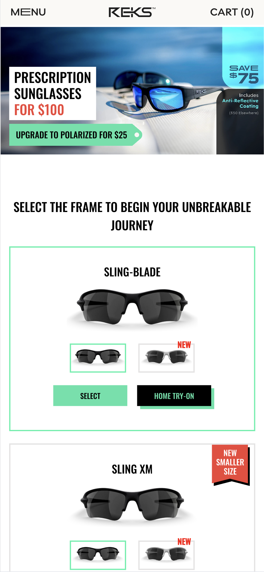
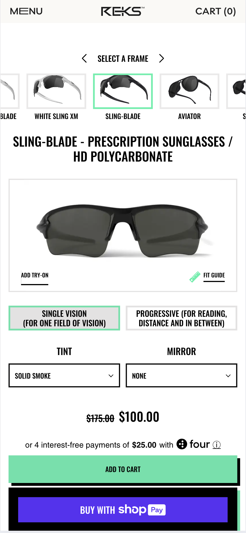
We made prototypes to test ideas before finishing the product. I focused on creating a prototype for the prescription page. In my solution, I ensured users weren't overwhelmed with too much information on one screen, which could confuse them and make them give up on buying. Also, I added clear descriptions for the best product options, which were missing before. In my prototype, I organized the purchasing process into sections and made it easy for users to understand.
My redesign of REKS Sunglass
prescription page
My redesign of REKS Sunglass
prescription page
My team and I were responsible for creating a prototype using Figma, so I made a prototype for the prescription screen.
Testing
User Testing
We devised detailed tasks to test our prototype with real users to validate whether our solution allowed them to complete the tasks quickly. Then, we interviewed four people to grasp their challenges while navigating the app.
We pitched questions on Figma using sticky notes to assess our design solution and made a vote to choose the best question.
Identifying the problem area
We devised detailed tasks to test our prototype with real users to validate whether our solution allowed them to complete the tasks quickly. Then, we interviewed four people to grasp their challenges while navigating the app.
My team and I rated the tasks, with 1 indicating ease and 5 displaying difficulty based on user performance, resulting in a cumulative score.
Biggest problem areas
Confusion over selecting the correct lens color for goggles.
Difficulty navigating the website to explore collections and promotions.
Uncertainty about securing the two ski goggles deals with differing quality options.
There is a lack of clarity on the information provided for each glass type.
Approach to Solutions
Add a touch-to-reveal highlight box with product explanations and a confirm button.
Introduce an email-style sticker for promotions at the start of the page.
Include a quality comparison chart for goggles.
Implement an info pop-up with definitions, benefits, and differences.
Final Design
For the final design, my team and I put in a lot of effort to enhance the Reks mobile app, aiming to improve the user experience. Starting with the homepage, we simplified the layout and information and included a search feature with typing suggestions. We added a chart to the
Ski Goggles page to make quality differences and technical terms visible, and we redesigned the product layout from vertical to horizontal so users can see everything without scrolling up and down. For the checkout page, we improved the functionality for adjusting product quantities, and we also added logos of other companies where Reks has been mentioned for reference. Users can click on the logos and be directly taken to their page.
Each team member led different app sections, including the home page, product page, and checkout page. I focused on working on the prescription sunglasses page, ensuring a smooth and user-friendly user experience.
Learnings
While working on this project, I learned much about collaboration, user experience design, and client interaction. I gained insights into working in teams to develop solutions and taking leadership roles within a project. My experience taught me the importance of clear communication and understanding the needs of both the client and the end users. Overall, I gained valuable skills in UX processes and teamwork.


